The St. Louis Cardinals is the pride of St. Louis. Winning 11 World Series, most recently in 2011 with David Freese and Albert Pujols, and 19 National League pennants, it’s no wonder why so many St. Louisans are proud about their home team and wearing their jerseys on home game days. Let’s take a look into the history of the St. Louis Cardinals’ logo, a symbol of St. Louisan pride.
1. 1900-1919
St. Louis’s professional baseball team actually started in 1875 as the St. Louis Brown Stockings which did not have an official logo. However, due to a scandal and many reorganizations, it wasn’t until Chris von der Ahe’s purchase and reorganization of the team in 1882 that many consider the franchise of what was to become the St. Louis Cardinals to begin. The team was shortened to just the St. Louis Browns, and the first-ever logo was unveiled in 1900 consisting of a bright-red interlocking “STL.”
The St. Louis Browns first played at Sportsman’s Park which was originally called the Grand Avenue Ball Grounds. In 1893, they moved to a new ballpark five blocks northwest named the Robison Field, originally New Sportsman’s Park.
This logo also inspired the name Cardinals after St. Louis Republic sportswriter Willie McHale overheard a fan remarking the team’s uniform saying, “What a lovely shade of cardinal.” McHale then started to nickname the team the Cardinals, and in 1900, it became the official name of the team.
![]()
2. 1920-1921
The St. Louis Cardinals did not have a smooth start. In their first 28 seasons, they had a .406 winning percentage, 1,632 wins, 2,425 losses, and 74 ties and was in last or next-to-last place sixteen times. To make matters worse, another MLB team from Milwaukee moved to St. Louis and named themselves, confusingly, the St. Louis Browns. Despite this, a new logo managed to come out with an arched “St. Louis” in red. Also in 1920, they moved back to Sportsman’s Park.

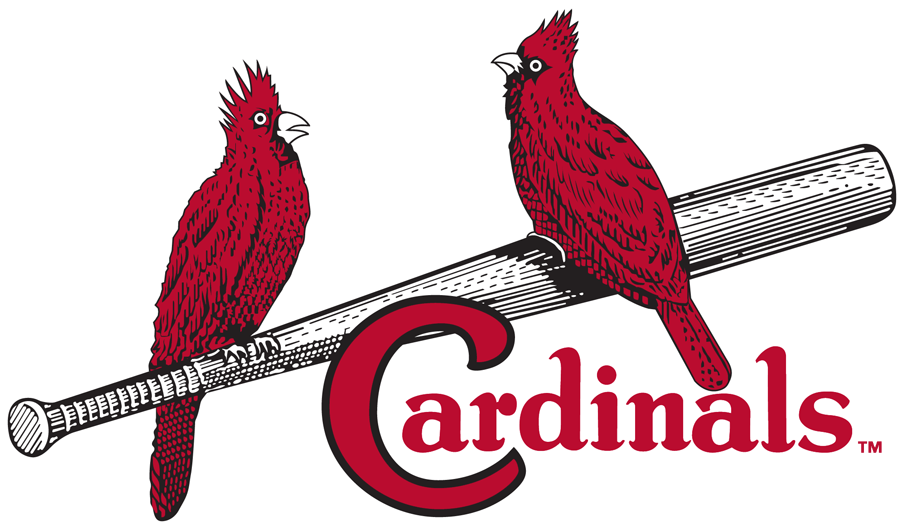
3. 1922-1926
The non-impressive previous logo was quickly changed to the famous birds and the bat design, with two simple, red cardinals resting on a black bat. The word “Cardinal” is below this with the letter “C” hanging on the bat. The team’s uniform featured pin-striping and piping along the seams which other teams will follow suit later.
The concept of using actual cardinals on the logo originated after general manager Branch Rickey was speaking at a Presbyterian church in Ferguson, Missouri. There, he saw a colorful cardboard arrangement featuring cardinal birds on a table. Allie May Schmidt produced this arrangement and her father, who is a graphic designer, helped Rickey make the logo a familiar staple on Cardinals uniforms.
![]()
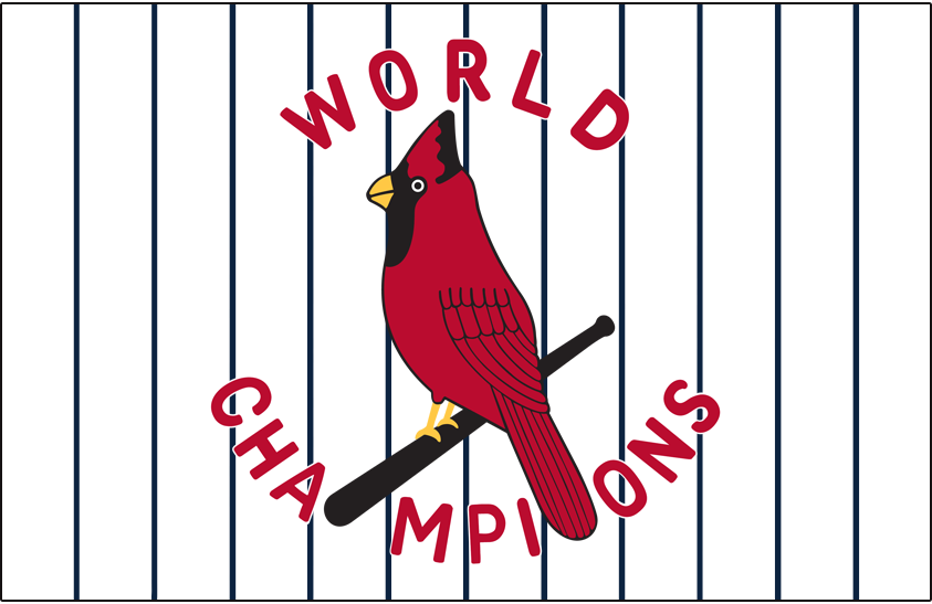
4. 1927-1928
The logo was changed for a year to celebrate an accomplishment for the Cardinals: winning their first World Series in 1926 against the New York Yankees with thanks to owner Samuel Breadon’s management skills. The logo features a single more detailed cardinal again resting on a black bat with the words “World Champions” surrounding it.
5. 1929-1948
The birds and the bat design from 1922 was brought back to become the team’s logo again, just with a slight update. The cardinals have more prominent red feathers resting on a silver bat. The “C” in Cardinals is much larger and has a black outline.
In 1940, the team’s caps were navy blue with red bills and had the famous interlocking “STL” in red. The jerseys were both cardinal red and navy blue.
It was a golden era for the Cardinals. The St. Louis Cardinals gained a lot of popularity nationwide thanks to radio which led to the term “Cardinal Nation.” The Cardinals (nicknamed the Gashouse Gang in the 1930s) went on to win the World Series in 1931 and 1934 and the National League pennant in 1928, 1930, 1931, and 1934 thanks to pitcher Dizzy Dean, first baseman Johnny Mize, and left fielder Joe Medwick. In the 1940s, talents such as outfielder and first baseman Stan Musial, third baseman Whitey Kurowski, and catcher Walker Cooper played for the Cardinals. The Cardinals had the highest winning percentage of any MLB team at that time at .623 with 960 wins. They went on to win the world series in 1942, 1944, and 1946 along with NL pennants in 1942, 1943, 1944, and 1946.
6. 1949-1955
During the post-WWII era with the baby boom, many MLB teams were streamlining their logos and uniforms. The Cardinals did the same featuring a more sleeker bat and simpler and more realistic cardinals. The “Cardinals” text is more curvy and in italics.
During this time, although the Cardinals didn’t win any World Series or National League pennants, they were able to manage 13 winning seasons from 1947 to 1963. Breadon sold the team in 1947, and Anheuser-Busch bought the team in 1953. Sportsman’s Park was renamed Busch Stadium (Busch Stadium I) although many locals still called it by its original name. That same year, the St. Louis Browns moved to Baltimore to become the Orioles.
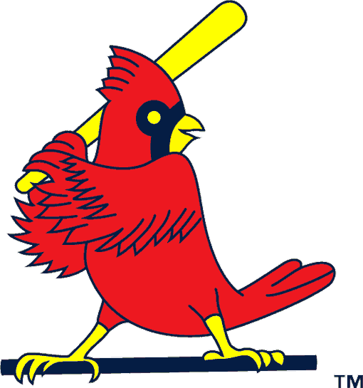
7. 1956-1964
A new logo yet again came out featuring a single cheerful bright-red cardinal up on base ready to bat with a yellow bat. It was dubbed the “Slugger bird”. However, this was used alongside a slightly modified version of the 1949 logo where the bat is instead yellow and the font for “Cardinals” is slightly different with it being in cursive.
The cap no longer had red bills, and for 1956 only, the uniforms had just the word “Cardinals” in cursive in a style similar to the Cubs.
The Cardinals struck gold after trading pitcher Ernie Broglio to the Cubs for outfielder Lou Brock. He along with third baseman Ken Boyer and pitcher Bob Gibson help bring the Cardinals to a World Series win in 1964.
8. 1965-1966
The logo was changed with the cardinal, now with a slightly darker red and looking more serious, perched on a yellow bat in front of a baseball, which is enclosed within a red circle with “St. Louis Cardinals” written in white around it.
The team’s caps were all red.
9. 1967-1997
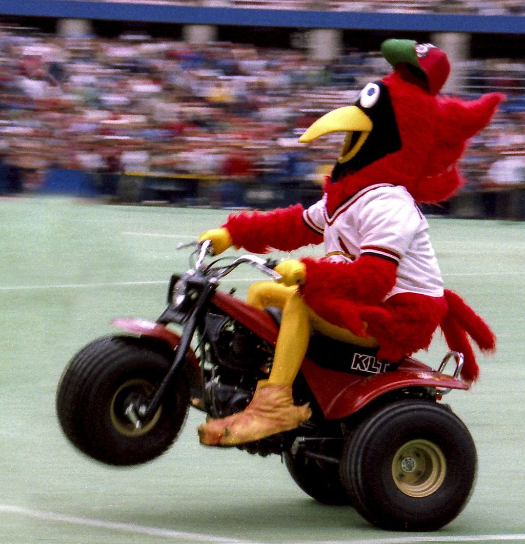
The Cardinals tried to make their overall image more friendly and personable. The logo was slightly changed with the cardinal instead facing forward and wearing a red baseball cap and having a red beak, looking more friendlier, cartoonish, and prouder. In addition, the Cardinal’s cartoonish mascot “Fredbird” was introduced in April of 1979 to appeal especially to younger audiences.
Another change was implemented with the construction of the Busch Memorial Stadium (Busch Stadium II) which opened in 1966. The Cardinals moved to this stadium, sharing it with the NFL Cardinals and later Rams teams.
The uniform in 1971 now had pullover knit jerseys and beltless elastic waist pants. However in 1992, it was reverted to traditional button-down shirts and pants with belts and also the all-navy cap.
![]()
This era was a successful one for the Cardinals. The Cardinals won the 1967 National League pennant and World Series against the Boston Red Sox thanks to MVP first baseman Orlando Cepeda and Bob Gibson, who managed to pitch three complete game victories during the World Series. The following year, the Cardinals won the National League pennant, and while they lost to the Detroit Tigers, Bob Gibson won MVP and Cy Young awards for his amazing pitching skills with an ERA of 1.12 and striking out 17 in Game 1 of the World Series, the most strikeouts in a World Series game ever.
Not much happened in the 1970s, but after receiving outfielder Willie McGee in 1981 and shortstop Ozzie Smith in 1982, the Cardinals had a very good defense. They won the World Series in 1982 from the Milwaukee Brewers and the NL pennants in 1985 and 1987. In 1985, in the “I-70 Series,” the Cardinals faced their cross-state rival, the Kansas City Royals. In this 7-game World Series, the Cardinals lost, partly because of a controversial call where Royals’ Jorge Orta was called safe despite replays.
10. 1998-1999
The logo was designed after 20 years, removing the circular background and replacing the cardinal with a more realistic and modern one with no baseball cap but with yellow eyes. A lighter red was used, and “Cardinals” is written in a sleeker cursive below the bird and the bat.
![]()
Not much happened in the 1990s, with the Cardinals doing mediocre, but in 1998 first baseman Mark McGuire competed with the Cubs’ Sammy Sosa for the most home runs in a season. McGuire, with 70 home runs in 1998, broke the record for the most home runs in a season, but that record was soon broken by current record holder San Francisco Giants’ Barry Bond with 73 in 2001.
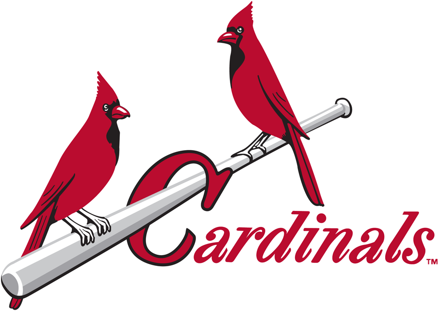
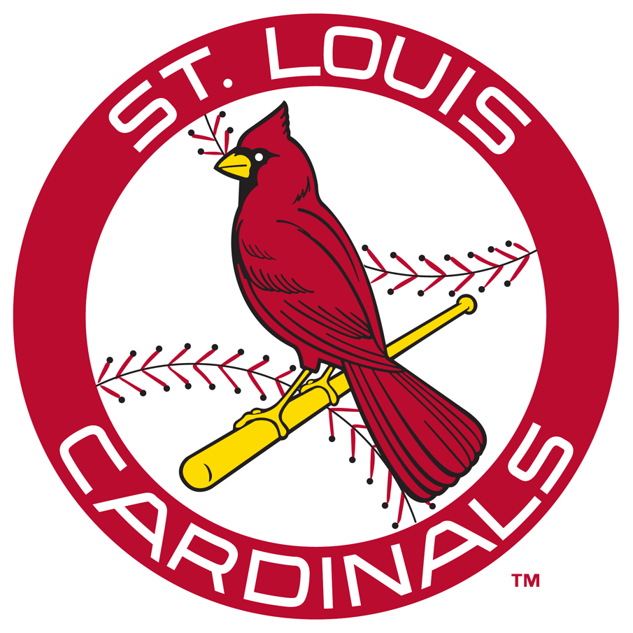
11. 1999-Present (The Current Logo)
There were very minor changes done to the logo. The cardinal’s eyes were now white with a blue hue for the outlines, the beak is now yellow, a lighter red was used, and the “C” in “Cardinals” is slightly longer.
In 2006, Busch Stadium (Busch Stadium III) opened and became the current home of the Cardinals. Costing $365 million, it replaced the now-demolished Busch Memorial Stadium.
![]()
In 2013, a secondary logo was released with “St. Louis” replacing the text “Cardinals” on the 1999 logo. The bat has more depth, and the cardinal has more detailed eyes and feathers. This logo is used on the alternative uniform, which was cream-colored, used for Saturday home games. (The Cardinals wear white for home games and gray for away games.)
![]()
In 2014, Ballpark Village, a dining and entertainment district with bars, hotels, restaurants, and other facilities centered around the Cardinals, opened across the street from Busch Stadium. There are more than 200 events annually, showing the great loyalty St. Louisans have for their home team.
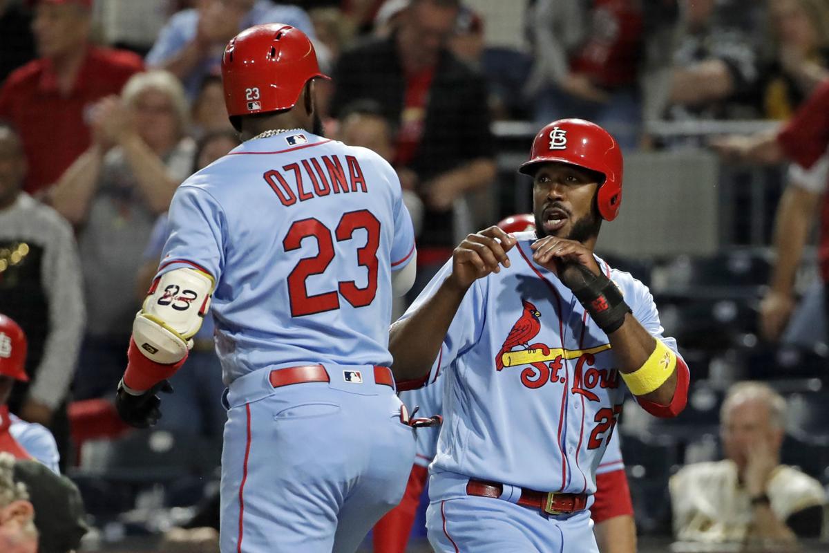
In 2019, the alternate uniform was replaced with a powder blue one called the “Victory Blue” uniforms.
The Cardinals went back on their feet in the early 21st century receiving center fielder Jim Edmonds in 2000, first baseman Albert Pujols in 2001, and third baseman Scott Rolen in 2002. These three sluggers along with pitcher Chris Carpenter helped bring the Cardinal to NL and World Series victories in 2004 and 2006.
In 2011, the Cardinals won the World Series against the Texas Rangers with Albert Pujols hitting three home runs in Game 3, and third baseman David Freese saving the Cardinals last minute with a home run in the bottom of the 11th inning in Game 6.
In 2012, former Cardinals backstop Mike Matheny became the new Cardinals manager. Key players drafted in 2009 were gained with first baseman Matt Adams in 2012, second baseman Matt Carpenter in 2011 with his hits and doubles, and starting pitchers Joe Kelly and Shelby Miller in 2012. With this, the Cardinals went on to win three consecutive NLCS titles in 2013, 2014, and 2015.
However in 2016 and 2017, the Cardinals failed to make it to the playoffs. After an embarrassing 8-2 loss against the Cincinnati Reds, Matheny was dismissed, and Mike Shildt took over.
In 2019, the Cardinals acquired all-star first baseman Paul Goldschmidt from the Arizona Diamondbacks. Him along with pitcher Jack Flaherty helped the Cardinals win the 2019 NLCS title. The following year, during the shortened 2020 season, they made it to the expanded playoffs, but lost to the San Diego Padres in the 2020 National League Wild Card Series.
Currently in July of 2021, the Cardinals are in a tight spot in third place with 50 W – 50 L, just trailing the Cincinnati Reds. The Cardinals have amazing players such as all-star third baseman Nolan Arenado with his hits and pitcher Adam Wainwright. However, the Cardinals have in general, under par pitching and many injuries. Only time will tell if they can hold it together to make it to the NLCS.
In conclusion, the Cardinals’ logo is an iconic symbol of St. Louis. The team represents the best of St. Louis, with a great history and 11 World Series wins, bringing together many St. Louisans from the fragmented city year after year cheering the Cardinals on. The Cardinals’ logo is simple, classic, and unique and represents the pride of St. Louis.
Sources
Birds on a Bat: The Evolution of the Cardinals Franchise Logo – TOKY
St. Louis Cardinals logo and their history | LogoMyWay
The History and Evolution of the St. Louis Cardinals Logo (moneyinc.com)
St. Louis Cardinals logo and symbol, meaning, history, PNG (1000logos.net)